 Skip to content



Why Painted Floral Prints Are Trending in Indian Festive Fashion
Florals have never really left Indian wardrobes, but this season they're taking a more artistic turn. Instead of the usual repeated motifs, painted floral prints borrow something closer to an artist's canvas - looser, less predictable, more like brushwork than pattern.
Oversized botanicals, visible brush textures, colour pairings you wouldn't expect on their own - that's the character here. It also solves something practical: how to make an outfit feel special without leaning entirely on embroidery.
A few places this is showing up this season.
1. Florals, but more artistic
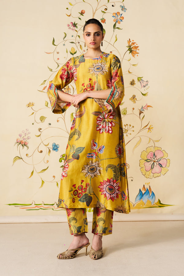
The appeal is in the irregularity. Instead of a motif repeating at a fixed size and spacing, the scale shifts, the placement loosens, the colour blends the way a brushstroke would.
The Sunbeam Kurta Set is a good example: oversized floral illustrations on a chartreuse base, coral, berry, olive and muted blue moving across the kurta and trousers. A fairly traditional shape ends up feeling a lot more expressive.
For a mehendi or a daytime lunch, colour and artwork do most of the work instead of surface embellishment.
2. Botanicals stepping outside the usual palette
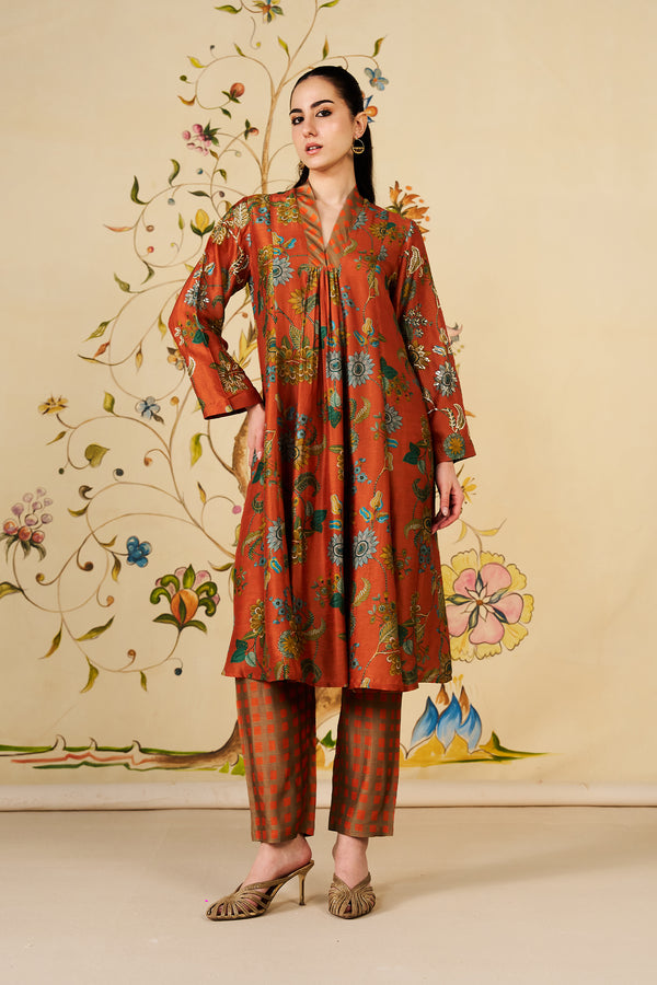
Florals used to default to soft pinks and pastels. Not so much anymore.
The Rosalie Kurta Set puts aqua, olive, ochre and muted blue against a rust base, a flared silhouette, gathered neckline, checked straight trousers underneath, so two patterns end up sharing one outfit.
Festive without being predictable, basically - a good pick if the usual jewel-tone rotation feels a bit tired.
3. Not just for traditional silhouettes
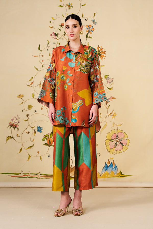
This translates into co-ords and relaxed separates just as easily as it does anything more traditional.
The Eden Co-ord Set pairs a relaxed button-down, oversized, hand-painted-looking botanical artwork with geometric wide-leg trousers. Rust, aqua, olive, marigold, and soft blue all in the mix, kept current by the easy fit.
Change the accessories and the same co-ord moves from a festive lunch to a family gathering without much effort.
4. An alternative to heavy embellishment
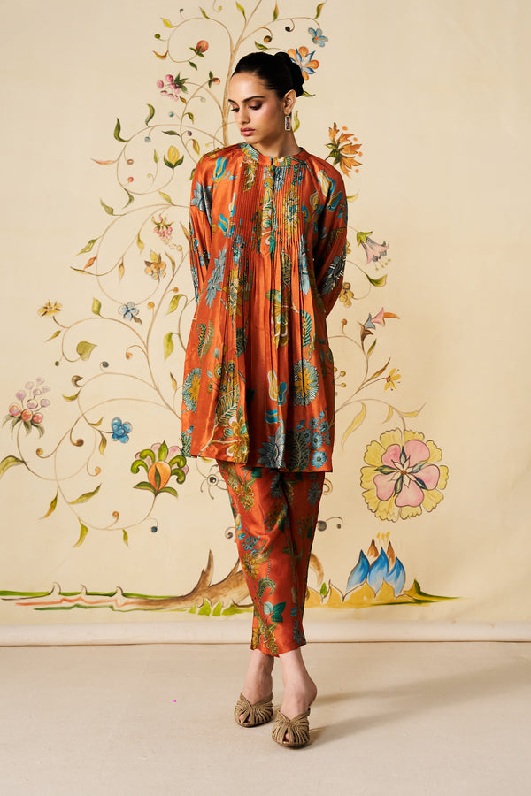
Festive doesn't have to mean sequins or zari. A strong print can carry the same visual weight while keeping the outfit lighter.
The Solana Co-ord Set is a coral base with painterly botanicals in teal, olive and muted blue — gentle pleating, a gathered neckline, voluminous sleeves, matching printed trousers. Works for a festive dinner or pre-wedding function without tipping into overly formal.
5. A moodier side
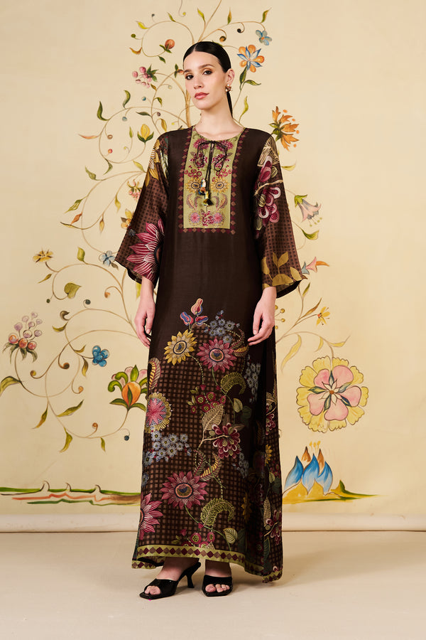
Not every floral needs to feel bright. Deeper palettes push botanical prints toward evening wear and more in-between festive occasions.
The Wild Reverie Kaftan runs espresso brown underneath painterly florals in muted berry, olive and soft gold. Flowing silhouette, wide sleeves, the botanical artwork staying central while the drape stays loose.
Different palette, completely different mood — this one's built for an evening, not an afternoon.
Why this is working right now
A lot of it comes down to wanting festive pieces that feel distinctive without being tied to one event. A painterly print doesn't announce itself the way heavy embroidery does, so it's easier to wear again.
Worth noting: hand-painted florals mean the fabric was actually painted by hand, one-off by nature. Painterly printed designs recreate that same brushwork feel through print instead — which means the same expressive quality can run consistently across a whole kurta set or co-ord, not just one panel.
Styling stays simple. Let the print be the focal point, keep jewellery restrained, tonal footwear, maybe a structured clutch. Brighter prints want fewer accessories around them; deeper palettes can take a bit of metallic for evening.
Where this goes from here
Florals stick around because they keep changing shape. This season it's the move from conventional motifs to something more painted and expressive - colour, scale, contemporary silhouettes - that's keeping them relevant.
Archana Shah's Painted Meadow collection runs with exactly that: expressive botanicals, fluid silhouettes, colour that doesn't hold back.
FAQs
Q1. What actually makes painted florals different from regular floral prints?
A: Regular florals repeat at a fixed scale. Painted florals don't - the scale shifts, placement feels irregular, colours blend the way brushwork does instead of sitting in neat repeats.
Q2. Will painted florals look too plain for a big occasion?
A: Not really. A strong print carries its own weight through colour and scale — no need for sequins or zari. For a dinner or pre-wedding function, it just ends up reading lighter, not lesser.
Q3. Are painted florals only bright and summery?
A: No. Espresso brown or rust with muted berry, olive or soft gold on top works well for evenings. Brighter combinations lean daytime, but that's a choice, not a rule.
Q4. How do I style a co-ord when the print's already loud?
A: Pull back everywhere else. Restrained jewellery, tonal footwear, maybe a structured clutch. Darker palettes can take a metallic accent for evening; brighter ones are usually better left alone.
Q5. Do I actually get more wear out of a painted floral kurta set?
A: Probably more than an embellished piece, yeah. The print's doing the work instead of embroidery, so you can shift the whole mood just by changing accessories.


